Where I live these days
Enough with excuses for being a constant MIA, and never showing anything of what I'm doing. How about I show you where I spend my time, and maybe some of what I'm doing there? Ready?
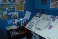 The is an overlook of the cube: my animation desk, shelves, wall of inspiring artists (Peter de Seve, Shag, Nathan J., Craig Thompson, Posy Simmonds and more). That's quite a big cube. It was meant to be for two people, but it's just a tiny bit too small for two desks. That's when it's nice to be a TA...
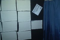 This is the wall I usually hang drawings or reference art on. Now there's some watercolor paper I'm stretching on it, for the backgrounds. It's quite the pain in the ass, but it'll be worth it.
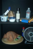 This is my other shelf unit. It's got some reference books (I'm very much into reference), sculpting stuff, a fan, a sculpture, tea-making stuff. The usual tuff, pretty much. In case youdidn'tt notice, the cube is in black andturquoisee, I painted it myself. And the floor is fake wood tiles that Ant installed for me. It's supercozyy. You have to make itcozyy or you can't really sit and work there for that many hours. I wish I had a carpet in it too, though...
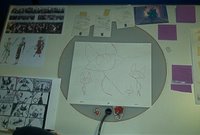 My desk and some animation (cats, surprised?). My animation desk is just as messy as my room's desk: notes all over the place, more inspiration art, pencils all over the place. Wonder I can even work... Doesn't really add up with my OCD tendencies...
More than that? Just working, animating, coloring. Some knitting done, but not as interesting. I found more awesome paper sources that make my crafting-creative juices going. All in good time... and when I have some extra cash...
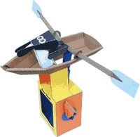 Oh, and check this out - paper machines?!Howw cool is that? I want the rowing sheep, I do, I do, I do!
P.S.
I just realized that it looks like my cube is really dark and dingy. Well, it's not. The lighting is far from ideal, but there's enough of it. Did I mention that I'd love a new digital camera for next x-mas?


0 Comments:
Post a Comment
<< Home